The Best Fonts and Colors for African Business Websites
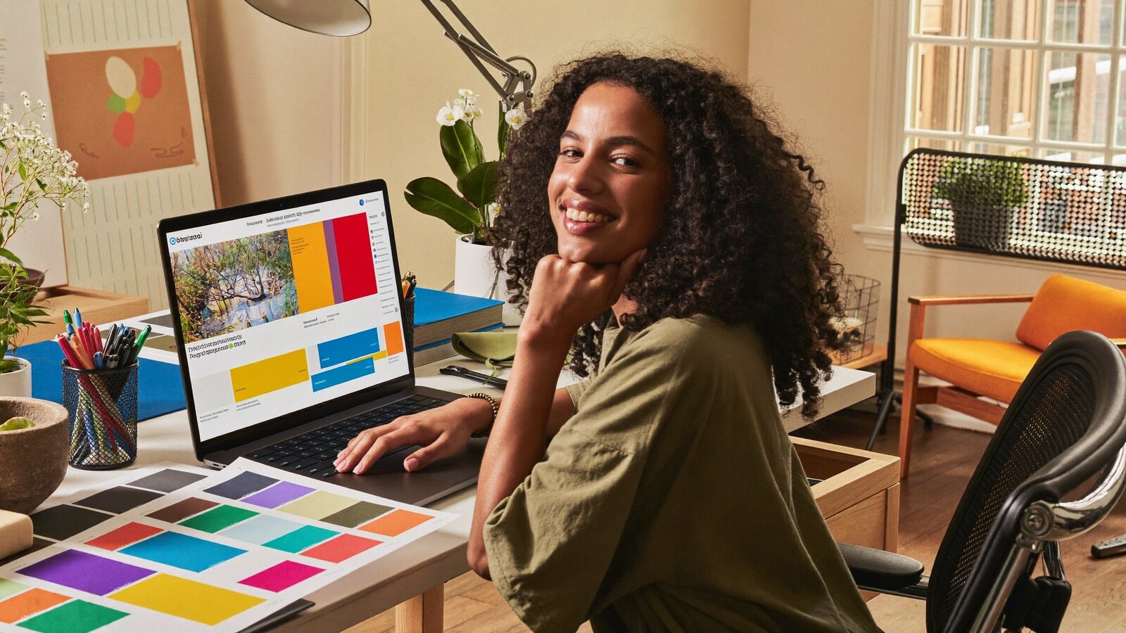
Before a visitor reads a single word, your colors and type have already told them whether you're premium or cheap.
Open a website and you judge it in about three seconds — long before you read anything. That snap judgement is made almost entirely by two things: the colors and the fonts. Get them right and a small Kigali business can look as polished as an international brand. Get them wrong and even a great product looks like a hastily made flyer. The frustrating part is that most "ugly" websites aren't broken — they're just using the wrong type and a clashing palette. Here's how to choose fonts and colors that make an African business look confident, trustworthy, and proudly local.
Why fonts and colors matter more than you think
Design isn't decoration — it's communication that happens faster than reading. Color triggers emotion instantly: warmth, trust, urgency, calm. Type sets the voice: a thin elegant font whispers luxury, a chunky bold one shouts energy. Together they form your visitor's first impression, and first impressions decide whether they stay or bounce. This is the front line of good UI/UX design for a Rwandan website — and it's also where trust begins. Ukuntu bigaragara ni byo bibanza — how it looks is what they meet first.
Choosing fonts: the rules that actually matter
You don't need to be a typographer. You need a few simple rules that stop the most common mistakes:
1. Use two fonts — not five
The fastest way to look amateur is to use a different font everywhere. Pros pick two: one display font for headings (personality) and one clean body font for paragraphs (readability). That's it. Two fonts, used consistently, instantly look intentional. If you want to be safe, even one good font family used in different weights beats a jumble of five.
2. Readability beats fancy — especially on mobile
Most Rwandans will meet your website on a phone, often on mobile data, sometimes in bright sunlight. A delicate script font that looks pretty on a designer's big screen becomes unreadable on a 6-inch phone. Body text should be clean, generously sized, and high-contrast. If a customer has to squint, they leave. Beautiful-but-unreadable is just unreadable.
3. Match the font to your business personality
Type carries a tone. Pick one that matches what you sell:
| Font style | Feels like | Great for |
|---|---|---|
| Clean sans-serif | Modern, simple, honest | Tech, startups, shops, most businesses |
| Classic serif | Established, premium, trusted | Law, finance, consulting, real estate |
| Bold display | Energetic, confident, loud | Events, fashion, food, creative brands |
| Rounded sans | Friendly, warm, approachable | Salons, schools, clinics, family brands |
Safe, free, professional pairings to start with: Poppins headings + Inter body. Or Montserrat headings + Open Sans body. Or a single workhorse like Inter across the whole site in bold and regular weights. All are free on Google Fonts, load fast on Rwandan mobile data, and never look cheap.
Choosing colors: a palette that sells
A good website palette is usually just three roles, not a rainbow. The pro formula is 60-30-10: 60% a dominant base (often a neutral or your brand's main color), 30% a secondary color, and 10% a bold accent reserved for the things you want clicked — buttons, links, calls to action. That single restrained accent is what guides the eye to "Buy" or "Contact". Too many strong colors and nothing stands out; byose bishyushye, nta na kimwe kigaragara — when everything shouts, nothing is heard.
The 60-30-10 colour balance
What colors quietly say
Color carries meaning before words do. You don't have to obey these rigidly, but it helps to know what each one signals:
| Colour | What it signals |
|---|---|
| Blue | Trust, calm, professionalism — banks, tech, healthcare |
| Green | Growth, money, nature, go — agri, finance, wellness |
| Orange | Energy, warmth, action — great for buttons & CTAs |
| Gold / Yellow | Premium, optimism, confidence — luxury & hospitality |
| Magenta / Red | Bold, passionate, urgent — fashion, food, sales |
| Deep purple / navy | Premium, serious, established — consulting, real estate |
Make sure people can actually read it
One rule overrides taste: contrast. Text must stand out clearly from its background. Pale grey text on a white background, or thin text over a busy photo, fails the moment someone opens it outdoors on a phone. Dark text on light, or light text on a deep solid color, is always safe. If you have to lean in to read your own draft, your customer already gave up. Accessibility isn't a nice-to-have here — it's whether the sale happens at all.
The African context: bold, warm, and proudly local
Here's the exciting part. There's a tired habit of African brands copying the same cold, minimal, grey "Silicon Valley" look to seem serious. But our brands have something more powerful to draw on — warmth and confident color. Rwandan and East African audiences respond to palettes that feel alive: deep indigos, warm golds, vivid greens, energetic oranges. Used with discipline (remember 60-30-10), these don't look "busy" — they look distinctly, proudly local and premium. The winning move isn't choosing between bold and professional; it's bold and professional, which is exactly the direction the best African web design trends in 2025 are heading.
And consistency is what ties it together. When your fonts and colors are the same on your website, your Instagram, your WhatsApp catalogue, and your business card, customers start to recognise you — and recognition becomes trust. That visual consistency is one of the strongest signals in building trust online as a Kigali business.
The bottom line: pick two fonts (one for headings, one for body), keep them readable on mobile, and build a three-role palette on the 60-30-10 rule with a single bold accent for clicks. Check your contrast, then lean into warm, confident African color instead of copying cold minimalism. Do this and a small Kigali brand looks like a big one — in the first three seconds. Igishushanyo cyiza kigurisha: good design sells.
Want a brand that looks premium everywhere?
Frame Africana designs fonts, colors, and websites that make Rwandan businesses look world-class — bold, consistent, and built to convert. Send us what you do and we'll show you a direction. We reply within hours.
Chat with Frame Africana on WhatsApp →